Wait! I Have a Better Dual Y-Axis Chart.
Looking for news you can trust?Subscribe to our free newsletters.
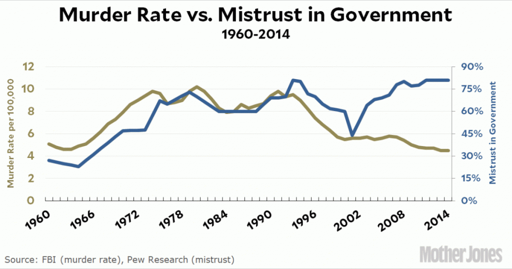
I blew it! In my post earlier this morning about charts with dual y-axes I picked some miscellaneous data as an illustration. Then I saw a tweet about an article written in October that lays out the relationship between trust in government and murder rates:
The murder rate since World War II has tracked almost perfectly, as criminologist Gary LaFree has observed, with the proportion of Americans who say they “trust the government in Washington to do what is right” most of the time and who believe that most public officials are honest.
How about that. But is it true? Here’s a lovely chart with dual y-axes to provide a quick visual check. Note that I’m plotting murder vs. mistrust in government, since that’s supposed to be the actual driving factor:
It actually fits pretty well until the late-90s, when mistrust started rising again but the murder rate kept going down. (The 9/11 attacks caused a spike downward and improved the fit, but that obviously shouldn’t be taken seriously. The divergence really began around 1998 or so.)
I have no comment on this, since I haven’t read LaFree’s book and really couldn’t judge it anyway. If anything, I might guess that an increase in murder rates is a factor in driving up mistrust in government, but who knows? As with the lead-crime hypothesis, you need a lot more than a single national correlation to make a case for causality.
However, it does show the usefulness of dual y-axes in a real world test. If you put these charts side-by-side, it would be hard to see if they match up. If you charted them on a single axis, the murder rate would look like a flat line down around zero. But with a dual axis you can pretty easily get a quick-and-dirty sense of whether there’s anything there. And if you then do the serious analysis to convince yourself that the correlation is real, the chart is a great visual illustration of your thesis.