Wage Growth Has Been . . . OK Over the Past Year
Looking for news you can trust?Subscribe to our free newsletters.
There must be something in the water. Today brings us another terrible chart, this time from the Wall Street Journal:
Come on. You can’t compare workers’ earnings to core PCE, which doesn’t include food or energy. Core PCE might be useful for the Fed when they set monetary policy, but it makes no sense when you’re trying to evaluate the real rise of workers’ earnings. Workers, after all, have to buy both food and energy.
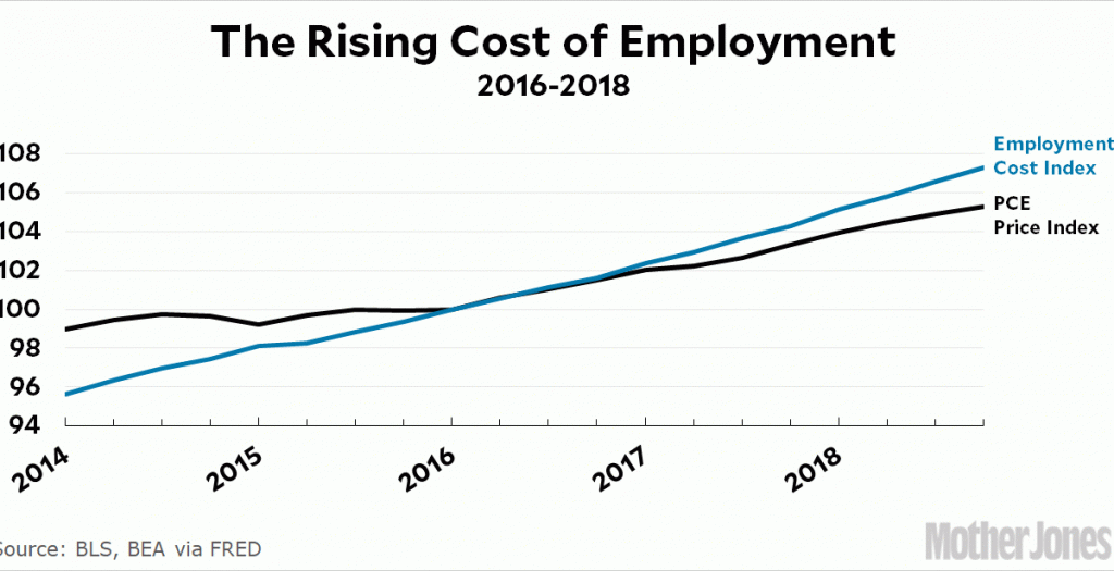
It’s also not very useful to chart this as percentage change, since that makes it hard to figure out how much worker pay has outpaced inflation over time. Finally, since the point of the article is that corporations are facing higher worker pay, it makes sense to show total worker compensation over the most recent few years. Here it is:
The Employment Cost Index shows the total cost of compensating workers. The ordinary PCE price index includes food and energy. And the two are indexed to 100 at the start of 2016 so we have a sense of recent changes in worker compensation.
This chart shows clearly that corporations, on average, are indeed paying their workers more. However, it also shows that the total increase has been a steady 0.7 percent annually over the course of three years. If that continues, it will “eat into corporate profits,” as the authors say, but not by an awful lot. Even if it goes up a bit, it won’t change corporate profits by all that much. This is all context that really ought to be included, especially in a publication aimed at sophisticated readers.
On an entirely different subject, there’s not much reason that non-investors should care about this. Business profits have been great in recent years, and if they flatten out or even decline a bit because workers are finally getting paid a little more, that’s just fine. For the vast majority of us, this is good news, not bad.