Three Maps Show How Fast Lockdown Fatigue Has Overcome Us
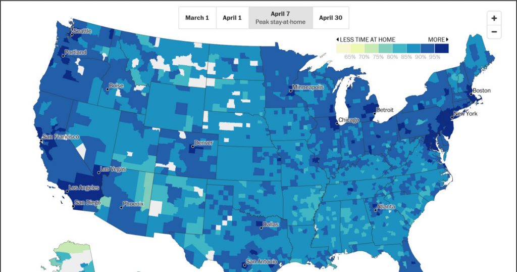
I’ve shown you this before in colorful chart form, but today the Washington Post presents it in even more colorful map form. These three maps show you how good we’re being about staying at home over the past month:
We peaked on April 7 and have been backsliding ever since. By April 30, a mere six weeks after lockdowns started, we were already back to about where we were on April 1. This is partly due to ordinary human fatigue, but also due to President Trump and his buddies telling us that it’s time to get back to normal, come what may.
By the way, I occasionally get someone asking me, basically, if I’m so smart then what do I think should be done? But it’s not really a question of what I think. As near as I can tell, expert opinion is all but unanimous:
Crush the curve. Keep lockdowns in place until—at minimum—the number of new cases has declined for 14 days in a row.
Test and trace. With the number of infections under control, keep it there with an aggressive program of testing and contact tracing.
The fact that so many people are unaware of this simple recommendation doesn’t speak well for either our media or our public health communications. In any case, this only works if we massively build up our testing capacity, and that doesn’t seem to be a high priority in the halls of power in our nation’s capital.