Italy’s Coronavirus Epidemic Has Peaked—But How About Everyone Else?
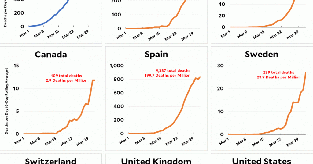
For indispensable reporting on the coronavirus crisis and more, subscribe to Mother Jones’ newsletters.This morning, as part of my daily report on the spread of coronavirus in western countries, I posted a chart showing that Italy’s daily death rate from COVID-19 seems to have hit its peak. That got me curious about all the other countries. Do any of them also show signs of being near their peak? Here’s the full set:
Note that all these charts begin on March 1 and the y-axis is just plain old daily deaths. I’ve used a 6-day rolling average to smooth out the noise.
There’s no good news here. Spain is showing a few glimmers of peaking, but none of the other countries looks anywhere close. We’re all still on the early exponential part of the curve and probably at least two weeks away from our respective peaks.


