How Are the Unrich Doing These Days?
David Leonhardt says we shouldn’t believe the GDP numbers that are released every quarter. It’s not that they’re inaccurate, it’s just that they show only a national aggregate. What we should be interested in is how various income groups are doing. It’s all very well to say that GDP has gone up 2 percent, but does this mean that everyone has gone up 2 percent, or that the poor have seen no gain while the affluent gained 4 percent?
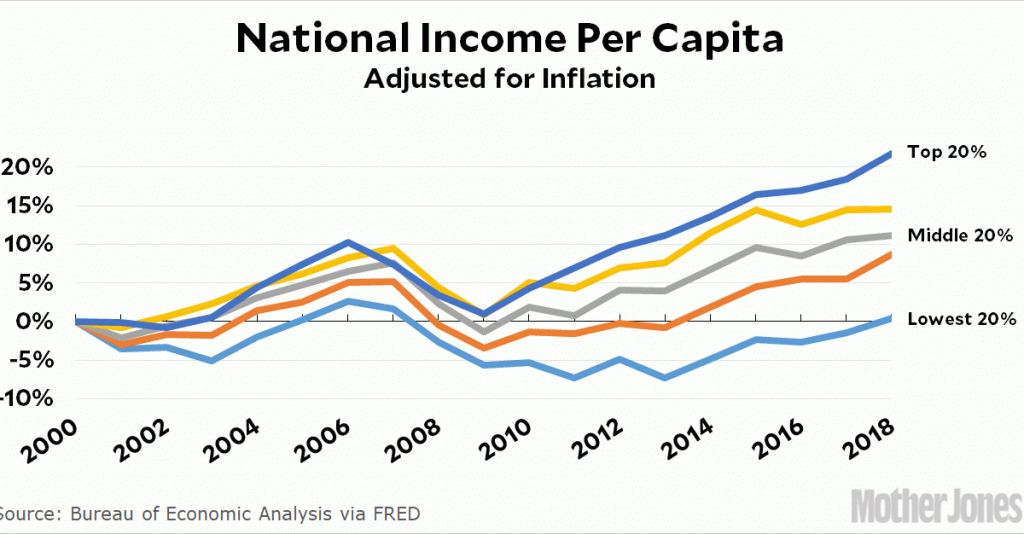
For that, we need to see GDP by income level, and apparently that’s something the BEA is working on. In the meantime, however, we can get a pretty good estimate. National income is pretty close to GDP, and we already have income shares by income level. All we have to do is convert shares to dollars, and then adjust for inflation and population growth. Here it is:
Since 2000, the richest fifth of Americans have seen their aggregate income increase by 23 percent. The poorest fifth of Americans have seen it increase by 0 percent. The folks in the middle and working classes have seen an increase of about 10 percent, or 0.5 percent per year.
Leonhardt says this is why so many people are dissatisfied: GDP may have gone up 40 percent since 2000, but when you adjust for population growth and then break things out by income level, working-class voters aren’t doing so great. When the BEA produces these figures, we’ll probably find out that the total GDP flowing to the working classes has increased by about 10 percent, just like national income.
So what does this mean? Well, Gallup reports that a third of Americans are “very satisfied” with their household income. But when you break the results down by income level, things look a little different:
Here’s another Gallup chart:
Wouldn’t you like to see that one broken out by income level? I would.


