Here’s a Regional Look at COVID-19 Deaths
Chad Orzel asked for a regional look at the COVID-19 death rate in the United States. As it happens, this is a huge pain in the ass because the boffins at the COVID Tracking Project make their data accessible in a virtually unsusable fashion. That’s why this is the one and only time you’ll ever see these charts (from me, anyway).
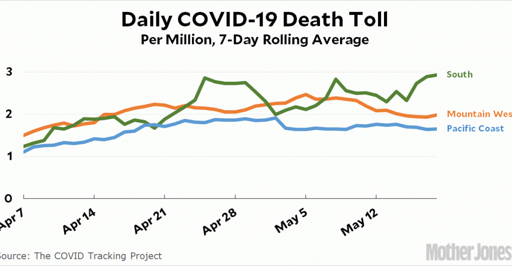
I would have preferred to put all five regions in one chart, but they were just too far apart. The Northeast peaked out at about 20 deaths per million while three of the other regions peaked out at only 3 deaths per million. Meanwhile, the Midwest was right in between:
The Northeast is declining after its mid-April peak, and the Midwest is declining too after its late-April peak.
The Mountain West and the Pacific Coast are both doing OK after peaking in early May. Alone among regions, the South has been steadily rising for over a month. This might not be the best time for them to eagerly start reopening their economies, but I don’t imagine they care what I think about it.