Here’s a Dashboard That Compares How Countries Are Doing on COVID-19
Here’s another estimate of the evolution of R0. It’s from Simas Kucinskas, a finance professor in Berlin:
As always, I’ll warn that this is guesswork at best since it’s based on unreliable data. Still, it’s the only data we have, and perhaps a rough idea is better than nothing.
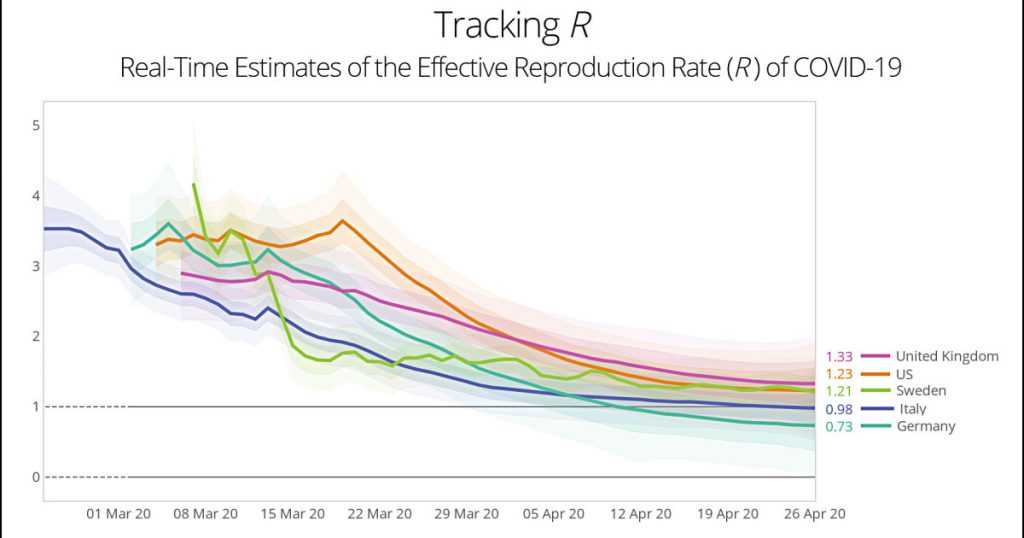
You can make a chart from your own collection of countries here. To the extent that this stuff is believable, I find Sweden the most interesting curve. They allegedly pushed their real-time value of R from 4 to 2 in the space of a single week. Impressive! On the downside, they haven’t pushed it very much farther down since then.
My expectation is that you’d normally see the value of R start high, and then there would be an inflection point when lockdowns and social distancing started taking effect. In these curves, you see that for Sweden and the US. But for the other three countries you don’t: there’s just a smooth downward slope. Why is that?
I can’t pretend to know how good these estimates are. But we’re all bored and everyone loves a dashboard that allows you to play around with different countries. So have fun, but don’t take any of it too seriously.