Chart of the Day: Stimulus Today vs. Stimulus in 2009
Today I’d like to show you a chart you probably haven’t seen before. Here it is:
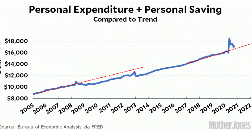
The blue line shows personal expenditure plus personal saving: in other words, the total amount of money that households have available to them. The two red lines show the trends of this number starting two years before the Great Recession and then two years before the current pandemic recession. The difference is stark.
In 2008, a housing bust produced a huge loss of household wealth and a concurrent reduction in household demand. This hurled the economy into the Great Recession, which led to large-scale unemployment and a substantial loss in household funds. Stimulus spending from the federal government amounted to $1 trillion over two years, which was nowhere near enough. As you can see, we never—not to this day—recovered to the old trendline.
The pandemic recession has been completely different. There was no huge loss of wealth and the federal government almost immediately pumped $2.2 trillion into the economy over the course of nine months. Today, we have not only recovered to the trendline, we’re above it—and getting ready to spend another trillion dollars.
This is a dramatic illustration of two things. First, what if we had done the same thing back in 2009? The equivalent amount of stimulus would have been in the range of $4-5 trillion over two years and probably would have stopped the recession cold. Second, we’re in surprisingly good shape right now. If the economy is able to fully open up this summer, there’s every reason to think that economic recovery will be quick. The main thing is to keep people whole, housed, and fed in the meantime.