Chart of the Day: How Much Do You Hate the Other Party?
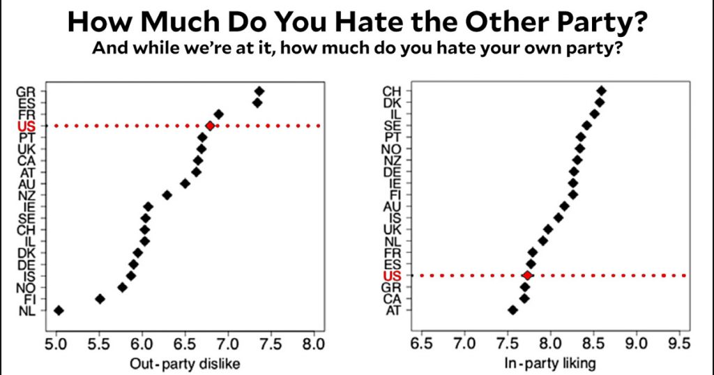
I don’t remember where I saw this, but a few days ago I came across a recent study that compares the US to other countries on the question of how much we hate the other political party. The authors created an overall metric for “affective polarization,” but I think it’s more interesting to break it into its two components. Here they are:
On the left, the US is quite high on dislike of the other party (i.e., what Democrats think of Republicans and vice versa). At the same time, the US is quite low on a measure of how much we like our party. In other words, most of us, on average, kind of hate both our own party and the other party. And this feeling has been growing over time.
The authors include some speculation about why this is, which you can read for yourself if you click the link. It’s mostly speculation, though, so I’m going to skip it for now. I just wanted to present this empirical evidence for its own sake, as something to ponder over.