Are Prime-Age Workers Still Coming Off the Sidelines to Join the Labor Market?
Looking for news you can trust?Subscribe to our free newsletters.
One of the key jobs statistics to keep an eye on is the employment ratio for prime-age workers. By looking only at workers between the age of 25-54, it eliminates issues of students still in school or changes in retirement rates due to an aging population. What it shows is only how many prime-age workers are engaged in market jobs. Here it is since the mid-80s:
EPOP has always been variable, going down during recessions and then back up during recoveries, but generally speaking it increased steadily for 50 years following World War II as more women entered the work force, peaking around 2000. However, during the dotcom recovery EPOP never got back to its previous peak, and as you can see, during the current recovery we haven’t even gotten pack to that peak. Will we ever? Or are we now seeing a steady downward trend over long periods of time? And why?
Nobody knows for sure, and there are lots of theories floating around. For our purposes today, however, the question is whether EPOP is continuing to increase right now. Neil Irwin points out that EPOP has been flat since February, which suggests new workers are no longer being enticed off the sidelines and into the job market anymore even with wages finally going up. This in turn suggests that the recovery is starting to slow down.
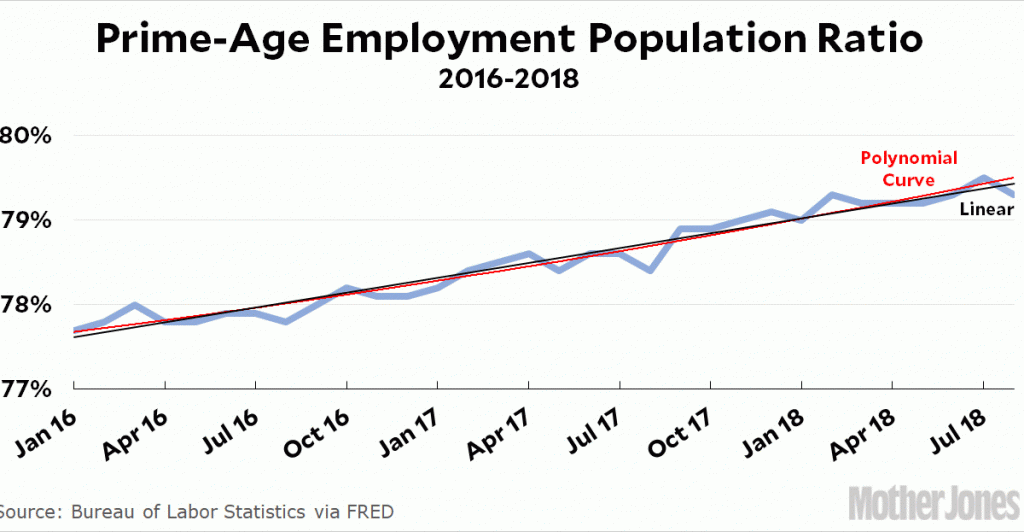
Dean Baker says this is just a coincidence: you only see this flatness if you carefully compare February to August, ignoring all the other months and the longer-term data. He’s right, and this gives me an interesting way of demonstrating this graphically. Here is EPOP for the past couple of years:
What I’ve done is run two default trend lines through the data. The black line is just a linear regression. But what if we use a polynomial fit, which would show us if the data is better represented by a simple curve? That’s the red line. As you can see, there’s only the slightest curve, though it is showing a slightly increased growth rate over the past 12 months.¹
My point here isn’t really to say anything about the jobs market, just to show an interesting way of graphically illustrating whether there’s much of a change from the linear trend. In this case there isn’t, which means the February-August flatness is almost certainly just a coincidence.
¹For you data nerds out there, the R² is 0.9499 for the linear trend and 0.9537 for the quadratic curve. Since you’d expect the quadratic to have at least a slightly better fit in all cases, this tiny difference suggests there’s nothing here. This is a linear growth rate so far, and that’s the best way to capture it.