Are Black Homeowners Suffering From Slow Price Growth?
In the Washington Post today, Michelle Singletary writes about the history of redlining and how it has destroyed the value of houses in Black neighborhoods. But then she says this:
“Politicians and advocates have long touted homeownership as the best way to build wealth, saying that over the long term, home values go in only one direction: up,” Tim Henderson wrote in a 2018 report for Stateline, an initiative of the Pew Charitable Trusts. “But since the dawn of the 21st century, that promise has been an empty one for many African Americans.”
The Stateline analysis of federal data found that in nearly 20 percent of the Zip codes where most homeowners are Black, home values had decreased since 2000, compared with only 2 percent in neighborhoods where Blacks were the minority.
That got me curious. There’s no question that homes in majority-Black neighborhoods are undervalued compared to similar homes in majority-White neighborhoods, but do they also appreciate more slowly? Here’s the Stateline data:
It’s true that there are many more majority-Black zip codes that lost value compared to other zip codes. However, there were also more majority-Black zip codes where prices doubled compared to other zip codes. In other words, Black neighborhoods may or may not have appreciated less overall, but they definitely showed more variance. Here’s another study of home buyers in 15 metro areas:
This study finds that Black homebuyers do better, on average, than white homebuyers. Here’s a third study, this one from the Center for American Progress:
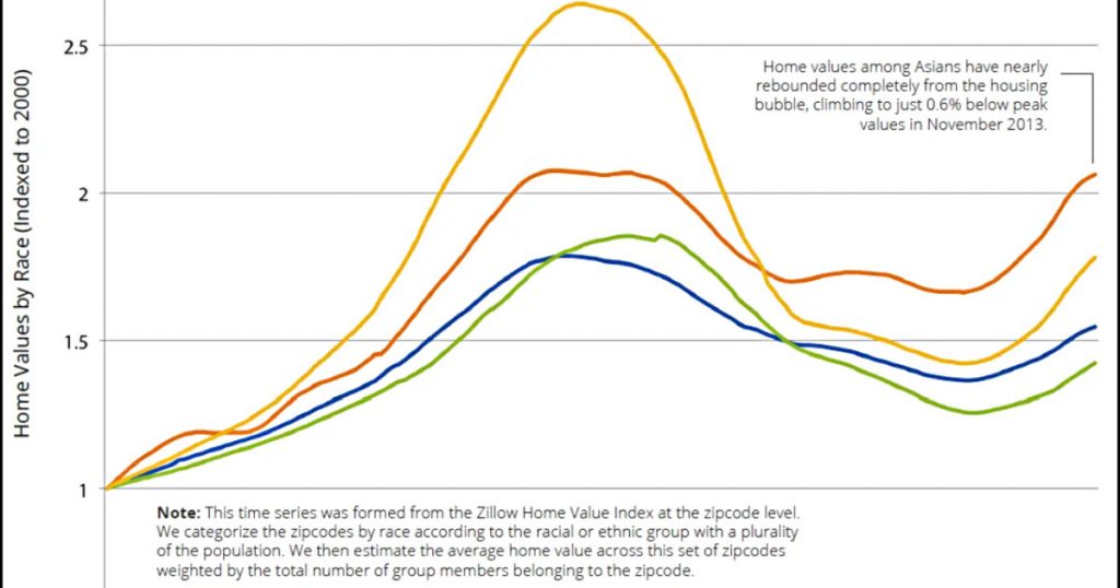
At all income levels, Black homebuyers do worse than white homebuyers. Finally, here’s a study based on data from Zillow:
The Zillow data shows that Black zip codes did worse than white zip codes, but only by a modest amount.
So what’s the right answer? The problem is twofold. First, two of these studies look at Black neighborhoods and two of them look at Black homebuyers. Intuitively, it seems like these should yield similar results, but they might not.
Second, these studies were done over four different timeframes: 2000-2017, 2012-2017, 2006-2017, and 2000-2013. I’m skeptical of the CAP figures, since they cherry-picked the peak of the housing bubble as their starting point, which also happens to be the peak of Black homeowner value. If you start at a peak it’s hardly surprising to show a substantial downturn, and sure enough, that’s what they show.
Put all this together, and the answer is: who knows? Your answer will vary depending on what you look at and what dates you choose. However, if I were forced to choose one of these as the most telling, I’d take the Zillow chart since its data covers the entire nation and it provides a useful time series that fits what I know about the bubble-era lending industry—although I’d sure like to see it extended to the present. It shows that over a somewhat longish term, home appreciation has been lower in Black neighborhoods than in white neighborhoods, primarily because of a huge drop following the housing bubble. The culprit here, however, is not Black neighborhoods per se, but the mortgage industry, which oversold to Black borrowers during the bubble and drove prices far higher than even normal bubble standards. That wretched episode has been documented in considerable detail in a lot of places, but you can read a good outline here if you want to learn more.