A Basic Cohort Test of the Lead-Crime Hypothesis
Looking for news you can trust?Subscribe to our free newsletters.
In my lead-crime roundup a few days ago, I mentioned that one of the only open critiques of the theory comes from cohort studies. This requires a little bit of explanation, so bear with me.
After the end of World War II, we started spewing lead into the atmosphere at increasing rates as more and more people drove cars. As a result, lead poisoning of infants got worse and worse up until around 1970. What this means is that if you look at crime statistics, you should see that the cohort of children born in 1970 are more crime prone than those born in 1950. Unfortunately, we don’t have crime figures by age for that era, so there’s no way to test this.
However, we do have that data starting in 1980. This is data for crimes committed in 1980 by teenagers, so it includes the cohort born in 1970, the peak lead year. We can then follow that cohort over time. Here’s what it looks like:
Basically, we’re looking at violent crime rates for 17-year-olds in 1987, 18-year-olds in 1988, and so forth. We can also do the same for other cohorts and then compare them. Before I do that, however, there are some caveats:
You can’t compare cohorts that are close together. Crime data is noisy, and lead is only a part of the explanation for crime. The difference between, say, kids born in 1970 and kids born in 1973 is just too small to compare. Other things will drown out the differences.
Increases in lead poisoning aren’t the main reason crime rates kept going up through the early 90s. That played a role, but the main driver of the big crime wave is the fact that we accumulated more and more cohorts that were lead poisoned. By 1985, for example, pretty much every age group from 15 to 25 was heavily lead poisoned. The same was true in 1980 and 1990, so you wouldn’t expect to see big differences in crime rates between those years. Once every age cohort is lead poisoned, crime is going to be really high, and it will get only modestly higher each year as the amount of lead poisoning slowly increases.
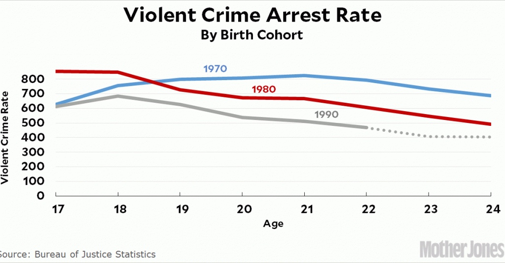
I hope this all makes sense. I’ve never seen the arrest data by age before, so this was genuinely new territory for me and I was pretty interested to see what it would look like. Here it is for the 1970, 1980, and 1990 birth cohorts:
I chose cohorts that were a decade apart in order to see real differences. And sure enough, this fits with the lead-crime hypothesis. Compared to the kids born in 1970, children born in 1980 were a little less lead poisoned and had generally lower crime rates. Children born in 1990 had even lower crime rates. I don’t show it in the chart above, but the earliest cohort we have records of, 1963, also has lower crime rates than the 1970 cohort, just as the theory predicts.
So far, so good. However, there’s another way to look at this data: by age. That is, we can look at 17-year-olds over time and compare them to 24-year-olds over time. Here’s what this looks like:
If 1970 is the peak lead year, theory predicts that the peak crime year for 17-year-olds should be 1987. For 24-year-olds it should be 1994. That’s obviously not what this chart shows. This might be because the data is noisy and it just can’t resolve differences of only seven years. But unless I’ve done something wrong, it doesn’t support the lead-crime hypothesis.
On the other hand, it’s widely known that the crack epidemic of the late 80s drove higher crime rates independently of lead. Starting around 1987, crime rates among 17-year-olds (born in 1970) went up far more than crime rates among 24-year-olds (born in 1963). That is what the lead-crime hypothesis predicts. Once you account for crack, perhaps the age chart does support the lead-crime hypothesis after all. Needless to say, this is the kind of thing that makes crime analysis so difficult.
Anyway, this is just a quick, amateur look at the data. There’s probably more sophisticated analysis that could tease out the cohort effect a little better. For now, though, I’d say that basic cohort analysis supports the lead-crime hypothesis, while age analysis might not. The age analysis results are especially peculiar given that incarceration data shows a very clear, very strong cohort effect. Incarceration has been declining for years, and the decline is much bigger for younger ages, which were the first ones to be born in a less lead-poisoned environment. Incarceration is obviously closely linked to arrests, so that means arrest data should also show a decline first for younger age groups and only later for older age groups. More research, please!


