Do Crime Declines Produce Higher Housing Prices?
Looking for news you can trust?Subscribe to our free newsletters.
Here’s something out of the blue. A few days ago I read Chris Hayes’ A Colony In a Nation, and in it he asserted that New York City’s big crime decline of the 90s and aughts was partly responsible for the city’s skyrocketing property prices starting around 2000. This is not only plausible, but almost undeniable. Of course people are willing to pay more to live in places with lower crime rates.
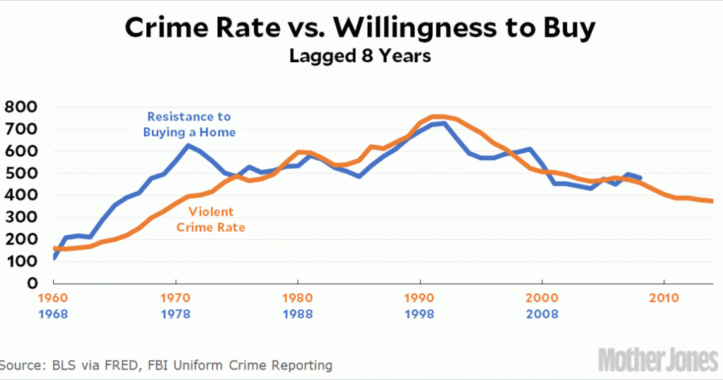
Plausible, yes. Undeniable, maybe. But is it true? I was curious, so I set out to figure out a way to crudely test this. First, I looked at national housing prices since 1960 and then deflated them by income. Since housing prices are represented by a BLS inflation index, the resulting number doesn’t directly represent anything concrete, but you can think of it as willingness to pay a certain percent of your income for a given size of house. I then did some arithmetic to make the resulting curve more readable and turned it upside down so it shows resistance to buying a home. Then I placed it on a chart along with the national crime rate. Here it is:
That’s actually kind of remarkable. Once I had the curve, I looked for the lag in years that produced the best eyeball fit. The answer was about eight years, which is what the chart above shows. Roughly speaking, from 1968 to 2000 people reduced the percentage of their income they were willing to spend on a home. Then that shifted and people were willing to spend more.
This is very crude for a number of reasons, but it’s suggestive that crime rates really do affect willingness to spend money on a home. So I tried a second test. In this one, I pulled out every city that has its own BLS inflation index for primary residence. Then I calculated two things for each city:
The change in the violent crime rate from its peak in 1991 to 2014.
The change in housing prices from 2000 to 2017, deflated by median income.
Our working theory is that cities with a bigger crime decline will show bigger housing price increases eight years later. Here’s the chart:
At a first pass, it looks like crime does indeed play a role. Cities with big crime declines also saw bigger increases in home prices. However, although the effect is real, it’s fairly modest. Crime appears to play a role, as we’d expect, but not a big one. It explains about 15 percent of the differences between cities, leaving 85 percent up to other causes.
Does a smallish effect like this validate our crime-housing theory? Or is it surprisingly low? I haven’t made up my mind about that. But here’s an interesting bit of data: if I lag home prices by only a few years, there’s no effect at all. The increase in home prices since 1995 shows no correlation at all with crime rates. This boosts the crime theory, I think, since we’d expect it to take a decade or so before people really started noticing that crime was dropping and became convinced that it was safer to move somewhere.
I did this out of curiosity, and there are plenty of reasons that it’s all pretty crude. The most serious, to me, is that the FBI uses agency reporting for crime while the BLS uses SMSAs for housing prices. So crime rates for Los Angeles, for example, include only crime reported by the LAPD, while home prices include Los Angeles, Orange County, and Riverside because they’re all part of the Los Angeles SMSA. A tighter look at home values would improve things, but I’m not sure where to find that data.
Mainly, I wanted to put this out there as motivation for someone with stronger housing and statistical chops than mine. With higher-quality data and proper controls, does the correlation still exist? Does it get stronger? Or does it stay modest? If anyone feels like doing a more sophisticated job on this, I’d be interested in seeing it.