Here’s a Misleading Picture of Religion Around the World
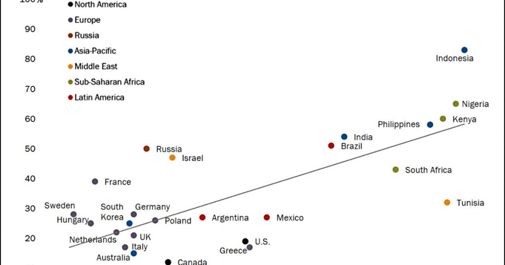
Here’s an interesting example of misleading with statistics. At least, I think so. Here’s the original chart from Pew Research:
Sure enough, there’s a strong trendline showing that people who say religion is very important also believe that religion has been growing more important since 2000.
But wait. It’s pretty obvious that the test countries are broken cleanly into two different groups, and the slope of the trendline is almost entirely driven by the second group being higher than the first on both measures. But what if you look at the two groups separately?
These trendlines are just eyeball efforts on my part, so don’t take them too seriously. Still, I don’t see much of a trend within either group, and the dots are scattered pretty widely around the trendlines.
So my tentative conclusion is that there’s no correlation at all between religion being personally important and believing that it plays a more important role than it used to. The whole effect is driven by the difference between these two groups, which, roughly speaking, is the difference between high-income countries and low-income countries. That might be an interesting topic, but it’s quite different from what Pew says about this.